


As 2026 draws to a close, trend forecasters turn their eyes to the future, offering their takes on the colors, materials, patterns and more that will shape the look and feel of homes for years to come. At the fall High Point Market, color experts and paint purveyors Sherwin-Williams shared their thoughts on what’s to come with the introduction of their 2027 Colormix Trend Forecast.
Dubbed “Rewild,” this year’s forecast proves a departure from those of the past, presenting a palette of colors rather than one or two standout hues with complementary palettes.
“Typically we would organize these colors into separate palettes, but Rewild represents a unified collection of 48 different colors,” said Clint E. Craven, designer market manager, Sherwin-Williams. “This palette can work across architecture, interiors, furnishings, appliances and other consumer products.”
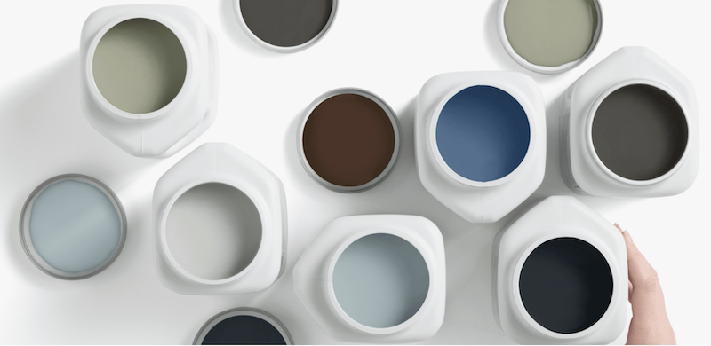
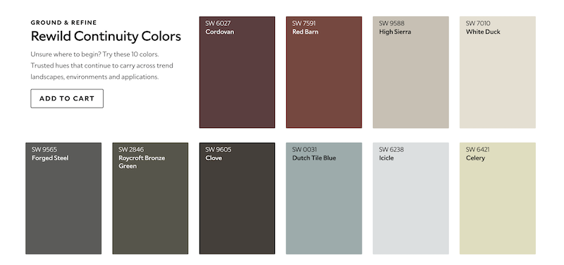
To create a sense of cohesion across such a broad palette, Sherwin-Williams identified 10 continuity colors for 2027 — hues designed to bridge the gap between various shades in the larger Rewild palette. These continuity colors range from deep-brown Cordovan to barely there white Icicle, with Red Barn, High Sierra, White Duck, Celery, Dutch Tile Blue, Roycroft Bronze Green, Clove and Forged Steel in between.
“These colors really support longevity that reduces the need for frequent redesign,” Craven said. “We want to create something that is going to last over time and make the environment seem relevant despite the different changes and trends.”
On the lighter end of the continuity colors, hues such as Icicle and White Duck, as well as shades from the larger Rewild palette such as White Snow and Drift of Mist, take on a milky undertone that makes them versatile neutrals.
“These colors are really good for restorative environments, health care spaces, hospitality spaces and, obviously, residential design,” Craven said.
In blues, shades such as Dutch Tile Blue and Quietude have lighter, grayer tones. “We’ll see this color associated with wellness, trust, longevity and biophilic design, giving you that emotional comfort within the space that doesn’t create stress,” Craven said. “These colors really enforce themes of stewardship and sustainability while creating a calm, tranquil space.”
Greens such as Celery and Jadite also reflect biophilic design’s growing influence on the home, “really reinforcing that connection with nature,” Craven said. “With yellow-leaning greens representing growth, wellness and regeneration.”
On the darker end of the spectrum, hues such as Cordovan, Roycroft Bronze Green and Forged Steel take a more subversive approach, according to Craven.
“These colors allow us to have emotional richness and sensory depth in a space,” he said. “These deep reds, grays, greens and browns create a lot of intimacy, warmth and comfort.”
But what’s driving these color trends? Craven pointed to several macro and micro shifts that are influencing the Rewild palette for 2027.
Craven identified one macro driver as “past renewal,” a shift from the novelty of trends to the regeneration and repurposing of movements from the past.
“You’re blending innovation with history, culture and craftsmanship,” he said. “We’re seeing 81% of designers sourcing products from the 1920s to the 1990s — reflecting an interest in different design styles that we’ve seen going toward heritage-inspired design.”
Another macro driver identified by Sherwin-Williams is “creative reset,” which can be seen as a reaction to the increasingly superficial, inauthentic nature of digital culture.
“Instead of automations or replications, consumers are seeking something authentic, that has an emotional connection and a human touch,” Craven said. “Gen Z, in particular, expects brands to be transparent and authentic — they’re not looking to support something that’s mass produced.”

Sherwin-Williams also acknowledged the power of the past through its third macro driver, which it called “memory has meaning.” Craven said this refers to the act of creating that emotional connection and cultural continuity that creates a more meaningful user experience for the people enjoying a space.
“It’s beautiful, but how does it make me feel? How are the senses being tapped into that room?” he said. “Whether it’s sight, smell, feel — having that tactile, sensory aspect is important. You want to create a space that is very immersive so that you will remember how you feel in it, or that it’s going to make you remember something from your childhood that brings joy.”
The final macro driver behind Rewild is “wellness and longevity,” something Craven said isn’t going away anytime soon.
“Since COVID, we realized our home is our sanctuary and needs to be a place where we can go and actually restore ourselves and feel better,” he said. “We have so much technology fatigue, and we’re constantly being stimulated by social media and things like that. So this is the idea of diving into how you rejuvenate yourself in your own space.”
Ultimately, Craven said the Rewild palette represents a sense of creativity in home design, where a more human-centered approach transcends trends to build spaces that speak to the people living in them.
“We’re really showing you how design is connecting nature, memory, craftsmanship, and just really bringing that human experience back into the space with the use of color,” he said. “We’re seeing designers balancing different innovations, colors with different environments, different authentic feelings, and just providing a little bit more meaning into the space instead of just the visual color.”